Open University
Platform for University Students
Duration
Ongoing Project
Type
Platform for University Students
Responsibilities
User research, sitemaps, UI Design
Problem
Students primarily utilize the student portal for three purposes: paying for their classes, registering for courses, and selecting their accommodation in the hostel. The student site has grown quite antiquated. Furthermore, appropriate resources that are intended to be used on a regular basis are not given to students. Finally, unless students conduct a thorough search on the school website, they are unable to obtain trustworthy information via the portal.
Solution
I added new features, such as schedules (timetables), student mail, and campus events, among others, to encourage students to use the portal on a daily basis. Since most students are always on their phones, I also made the portal more user-friendly by developing a mobile app. Additionally, by adding the notification section, which facilitates quick contact and information flow from the school to the students, the portal was made more useful by giving students access to relevant details.
Understanding the User
In order to learn how the students currently use the portal and what features they would want to see in the new version, I started my study using a straightforward Google search
Research Insights
Key Findings:
- Most resources that are not on the dashboard are ignored by students.
- Absence of important alerts and news.
- There are some missing resources on the portal.
- It can be unsettling for a new student to change the default password.
- Students need a feature on the dashboard that lists their "most used links."
- Students would like to see the following new features: timetables, student mail, scholarship opportunities, and a campus map (for newcomers only). View the school's upcoming events, the ability to modify the portal profile image.
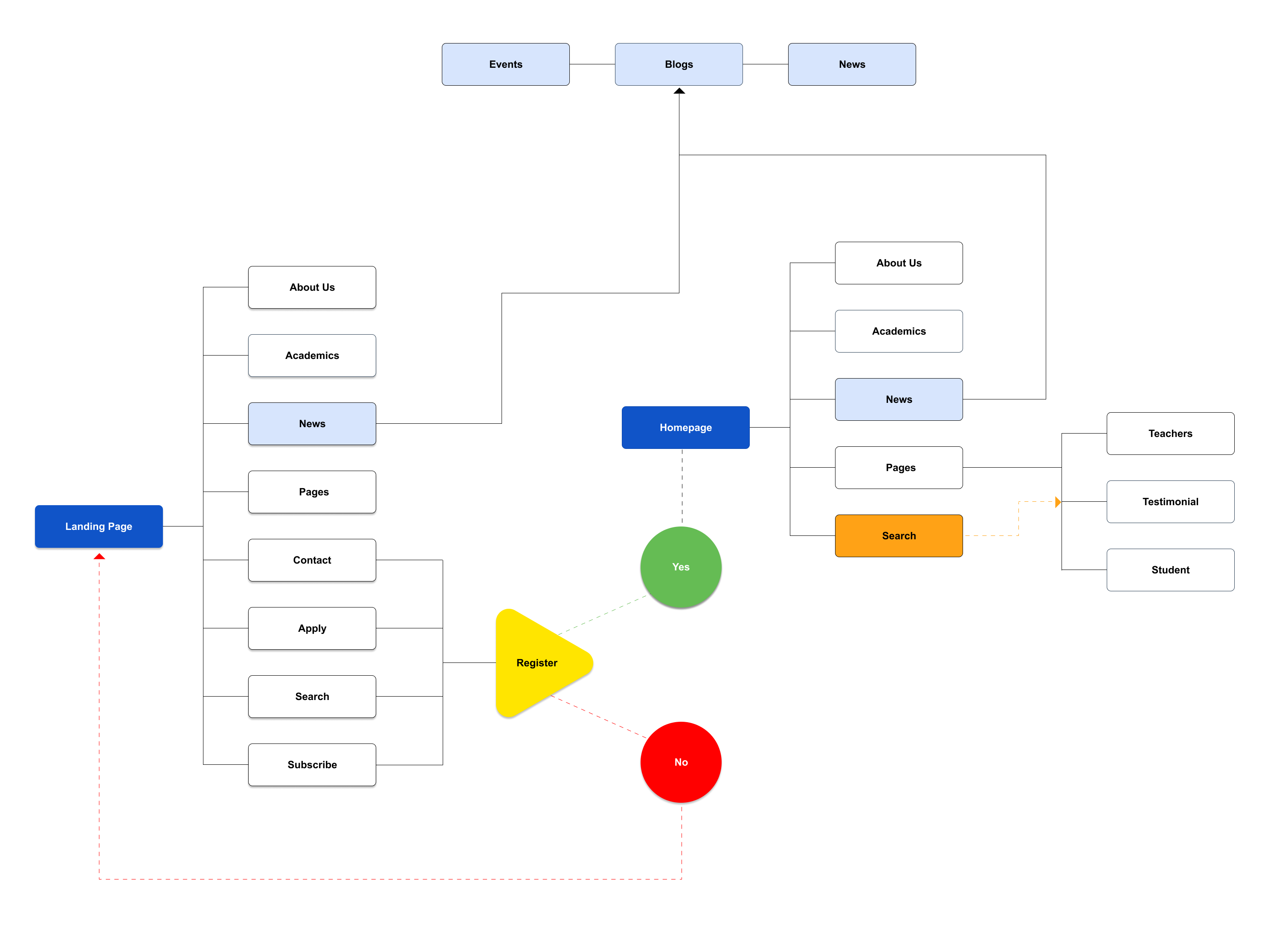
Sitemap
I proceeded with my design process by sketching out the product's structure.
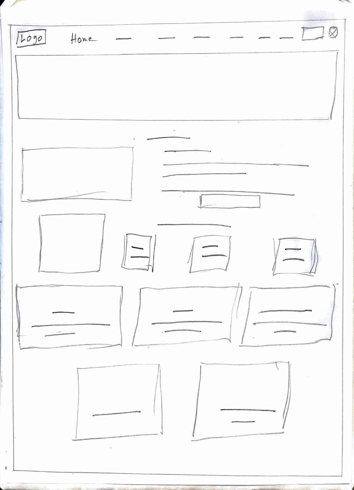
Sketches
I started with some rough sketches of the home page layout to start the design phase. I wanted the user to be able to view their daily tasks, assignments, plans, and advancement. The sketches that follow reflect these features.
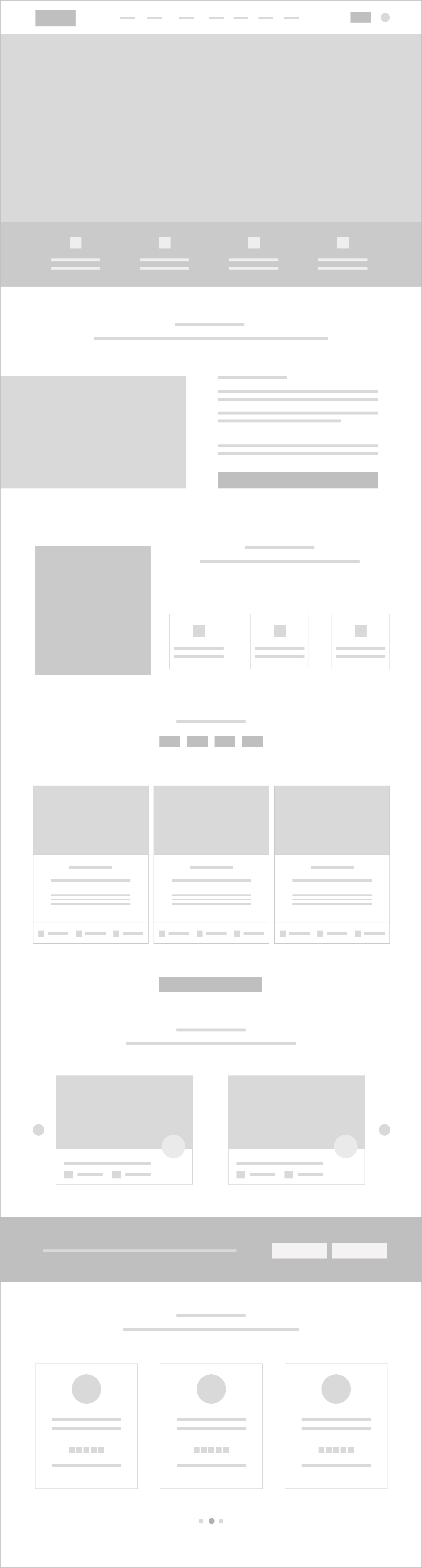
Wireframe
It was time to start the design process now that I had an idea of some of the key tasks the user wanted to do. I started by using Figma to develop low-fidelity wireframes.
Low-Fidelity Prototypes
I created a low-fidelity prototype using the wireframe framework after a strong foundation was formed. This helped determine how functional and engaging the present design was at this point.
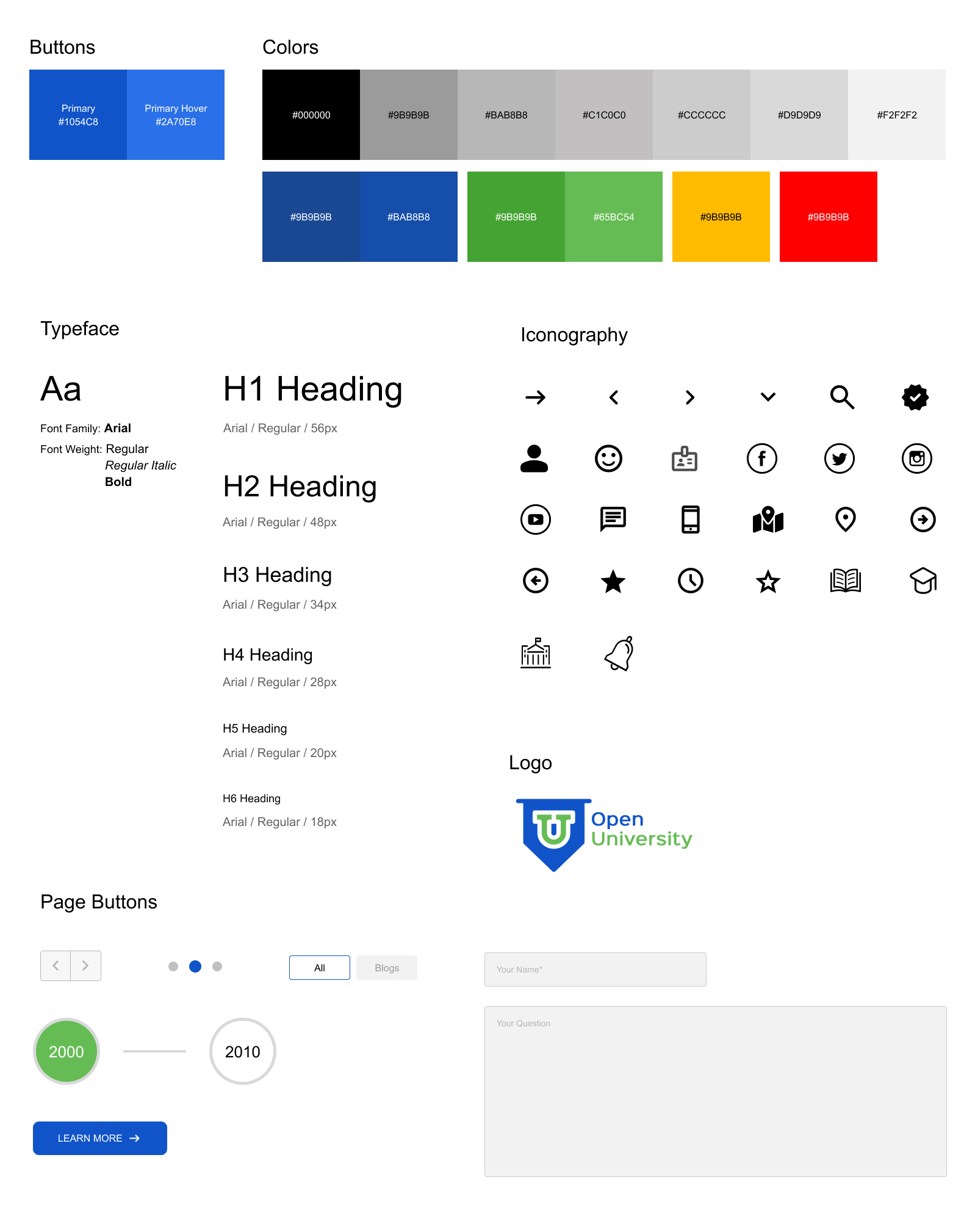
Style Guide
To make sure that we established the rules and expectations before beginning UI design, the team produced a style guide.
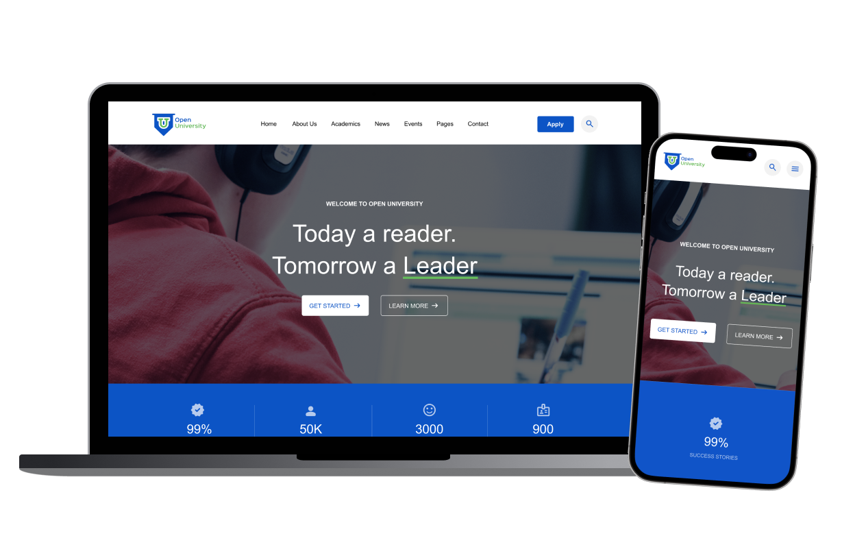
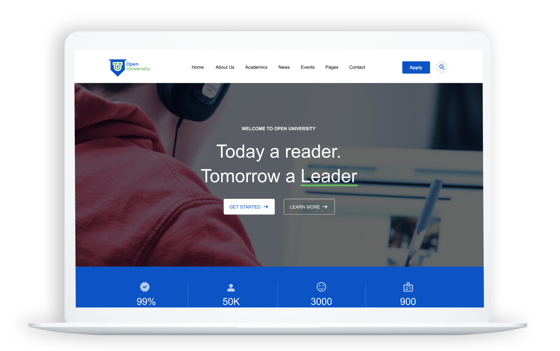
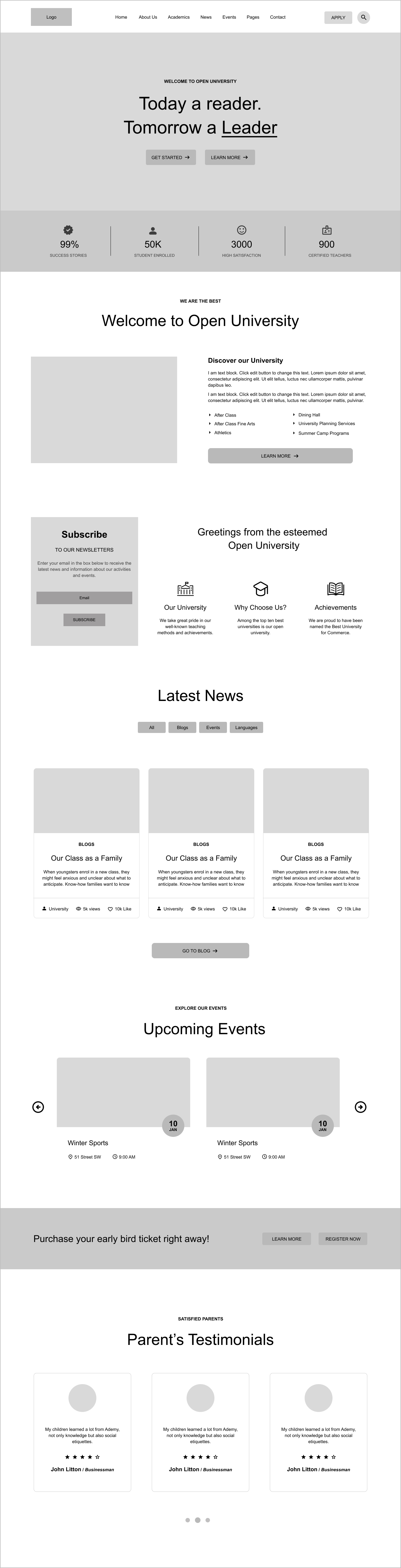
Final Design
After receiving user feedback and iterating on the prototype, the final design was complete.
The final high-fidelity prototype can be tested below. Feel free to press F on your keyboard or click the maximize icon in the top right of the frame below to enter full-screen mode. You can also press R to reset the user flow.