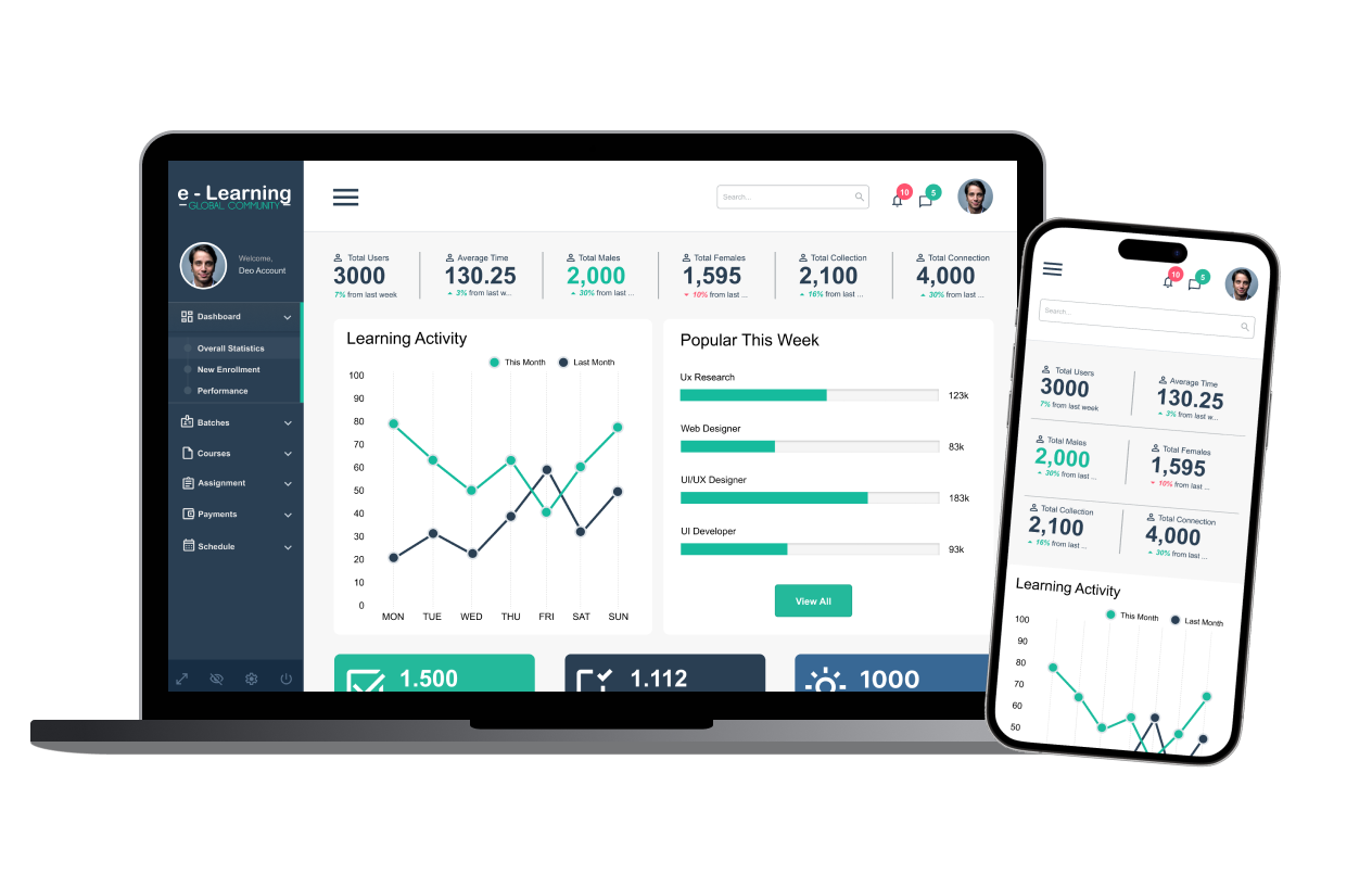
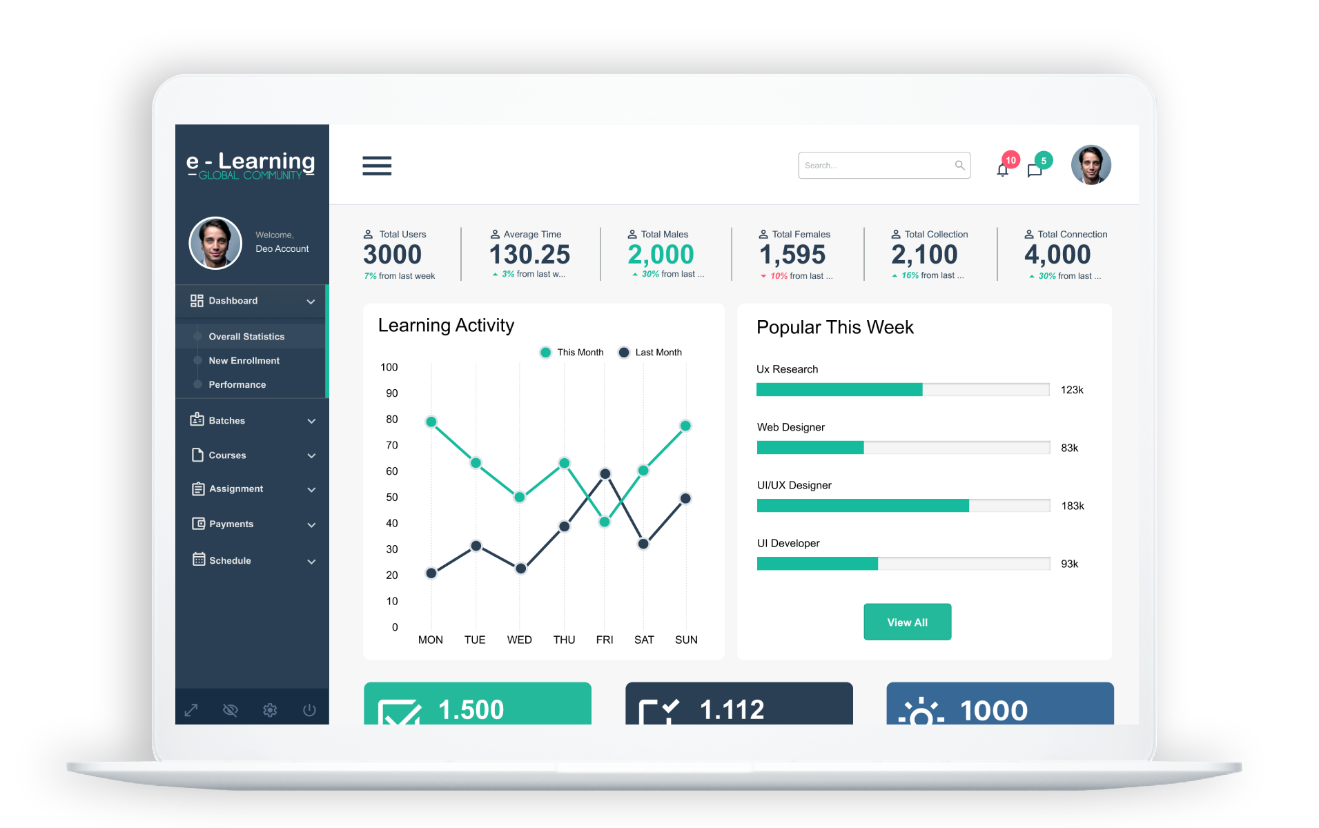
eLearning Dashboard
The teachers' dashboard in the perfect place
Duration
Ongoing Project
Type
A platform that allows teachers to monitor student activity
Responsibilities
User research, sitemaps, UI Design
Problem
Since the closure of schools to stop unnecessary COVID-19 outbreaks, e-learning has become the only dependable means of delivering education.
Making the move to online learning wasn't simple, though. Across the nation, a sizable portion of tutors had never used technology in the classroom.
We had previously worked on a smooth tutor onboarding process, but one of the biggest challenges was to make the dashboard extremely user-friendly and straightforward so that someone who had never used a computer could understand exactly what was going on.
Solution
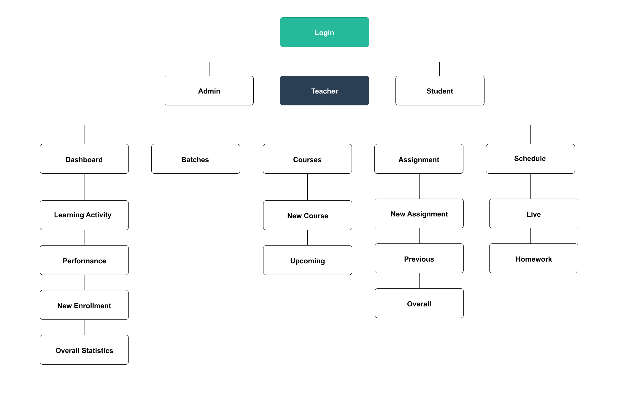
1. Information Architecture
This step was very important to the entire redesign because it required a lot of data to be shown and multiple actions to be taken. We developed the dashboard's architecture with the goal of creating a clutter-free user interface.
2. Sketches
I started with some rough sketches of the home page layout to start the design phase. I wanted the user to be able to view their daily tasks, assignments, plans, and advancement. The sketches that follow reflect these features.
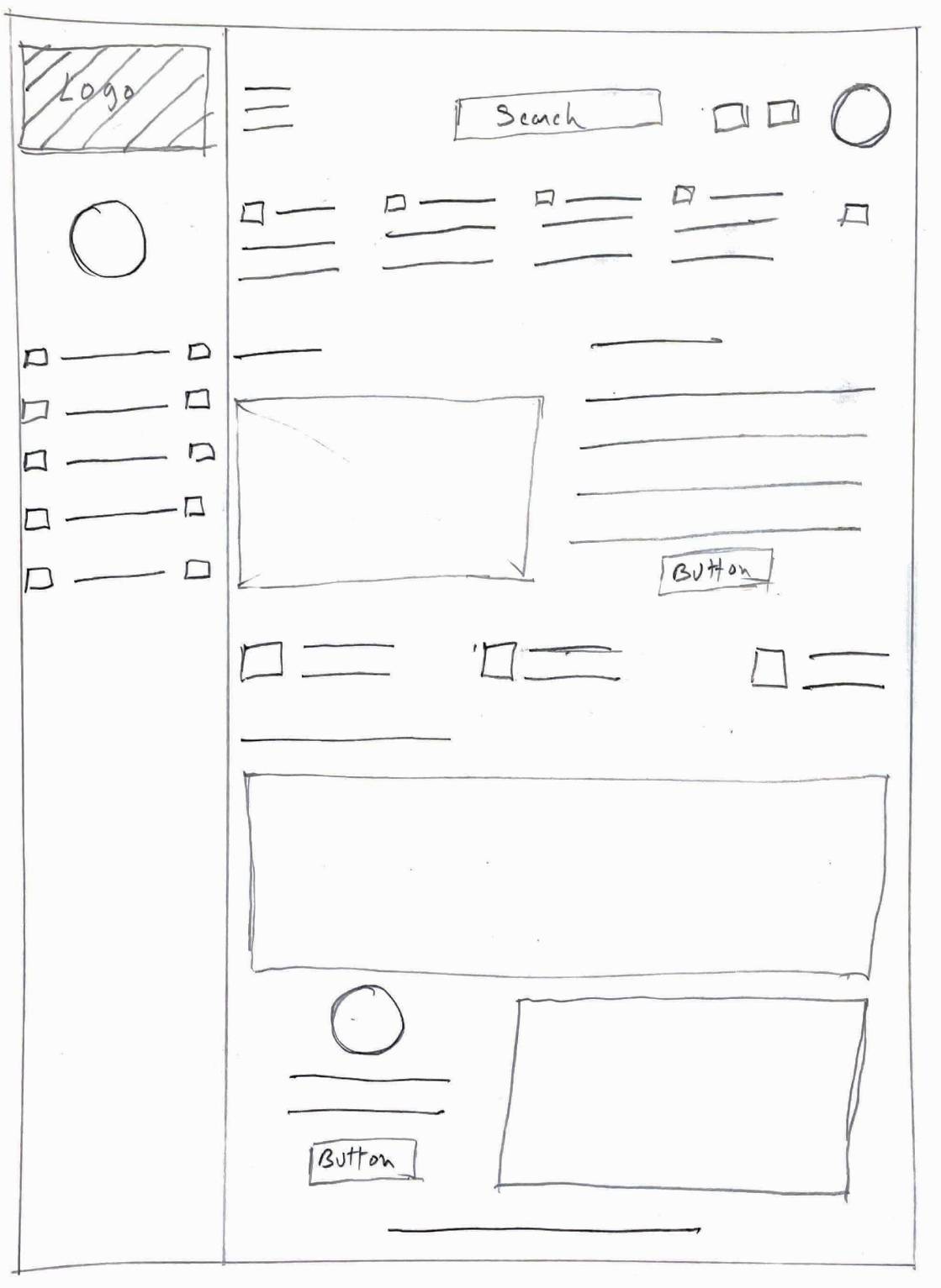
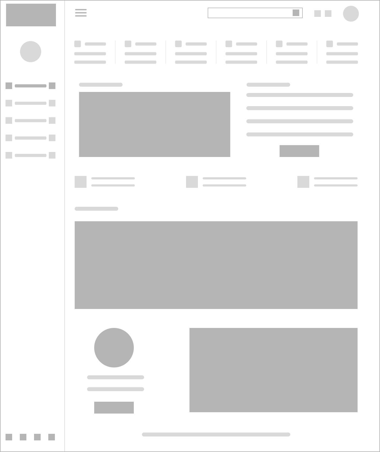
3. Wireframe
It was time to start the design process now that I had an idea of some of the key tasks the user wanted to do. I started by using Figma to develop low-fidelity wireframes.
4. Low-Fidelity Prototypes
I created a low-fidelity prototype using the wireframe framework after a strong foundation was formed. This helped determine how functional and engaging the present design was at this point.
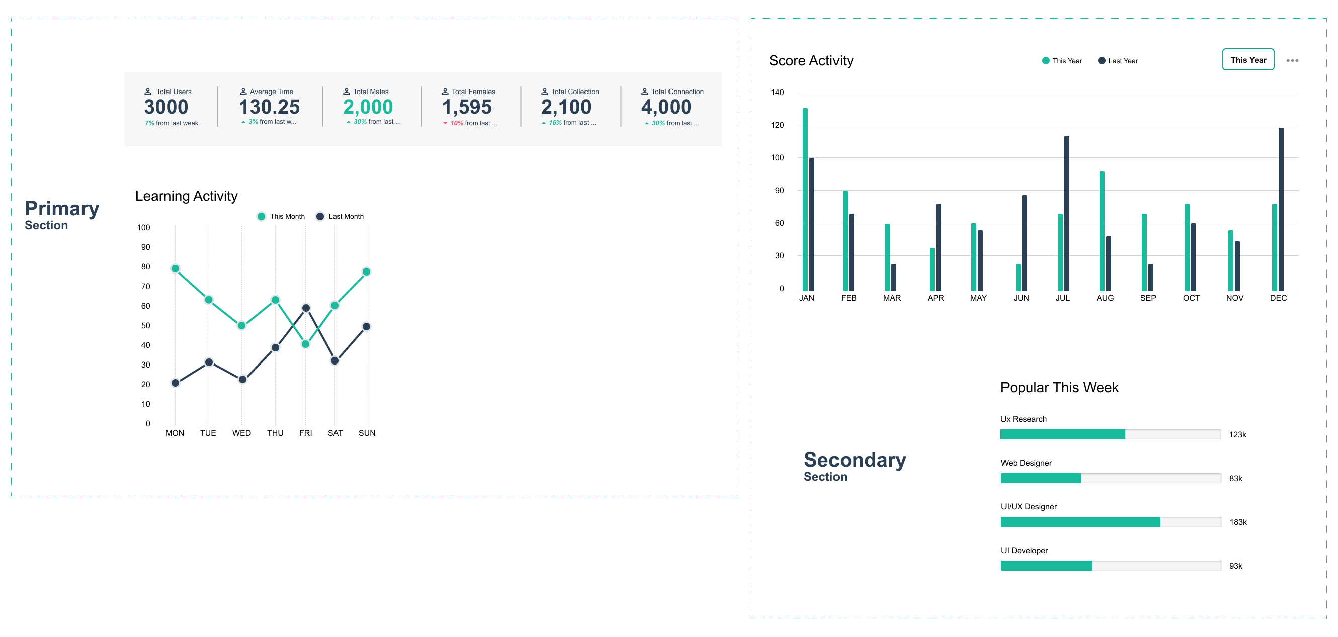
5. Page Layout
We made the decision to create two main sections on the dashboard:
1. Primary Section:
Tutors would be able to monitor their progress and carry out other crucial tasks like scheduling live lectures, maintaining attendance, managing assignments, courses, payments, and their own website/store with the help of these dynamic features.
2. Secondary Section:
This section would be more dynamic and primarily comprise real-time updates about things like sales performance, newly admitted students, and recent student questions.
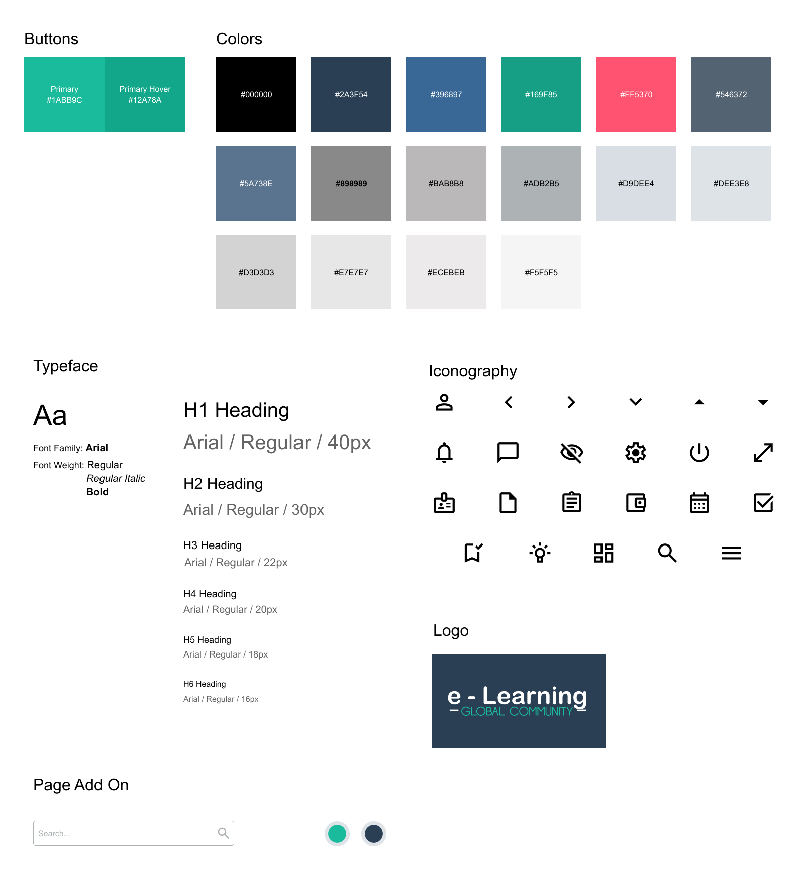
6. Style Guide
To make sure that we established the rules and expectations before beginning UI design, the team produced a style guide.
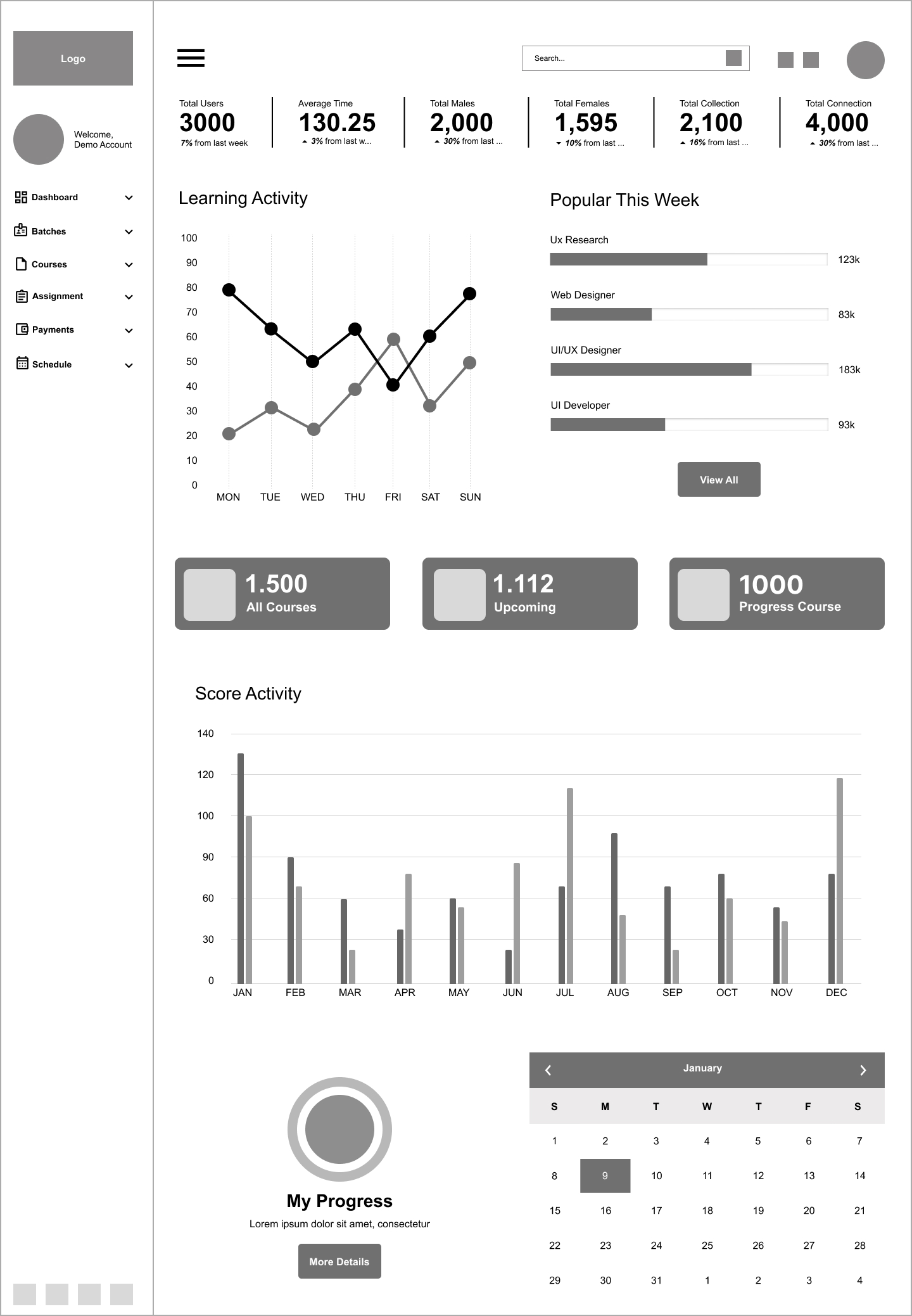
Bringing everything together
This marked the end of the redesign process. By this point, I'd worked out a system and it was time to organize everything.
Making sure the information architecture was sound wasn't sufficient because there was a lot of content and tasks to be completed. However, after numerous revisions and comments, I managed to pull it off.
The final dashboard appeared like this: